I came to design a true novice – so ignorant that I thought I already knew most of what there was to be known and was sure talent, confidence, and dedication would be enough to make me a graphic designer. This has turned out to be true only in the sense that because of those things I am now aware of how much I don’t know, and am now ravenously curios to learn more. My original assumption of design – specifically corporate and product design for digital mediums – was as vague and ignorant as saying, “Because I know movies are made with cameras, and I have a camera, I know how to make movies.”
First off, I’m not really a ‘graphic designer.’ That term is horribly vague. I’m more of a user interface designer and fledging user experience designer. But more on that later.
I was introduced to Photoshop at a young age, when a good friend and mentor of mine plopped a disc into my computer and said, “Have fun with this.” I did. I was homeschooled for six years, and spent most of that time doing everything I could on the computer other than schoolwork. With the progression from dial-up to DSL came a whole new world of Photoshop tutorials. I did them endlessly, making buttons and spacescapes, painting awkward faces and eyes with my mouse and the brush tool, and learning how to make text look like it was exploding out of the computer screen.
I never suspected that the obsessive hours I spent trying to make space-gas look realistic would turn out to be the foundation for what is quickly becoming my career.
Before becoming a professional designer, I lumped the term ‘design’ into a few different categories – fashion design (figuring out how to make clothes look good), car design (figuring out how to make cars look good), and graphic design (figuring out how to make stuff in Photoshop look good). All other forms of design I didn’t consider to be ‘real’ design – sort of the way some jewelry makers and florists consider themselves to be ‘storytellers.’
I had a brief glimpse of the true depth and awesome complexity of design during my stay in New York, when my editing teacher took me to the Metropolitan Museum of Modern Art and showed me old telephones and Macintosh computers and, most peculiar of all, a Vespa on a slowly revolving pedestal. When I asked him why those things were in an art museum he looked pityingly at me and said, with a gentle tact I probably would not have managed had our places been reversed, “To some people, this is art.”
My familiarity with Photoshop, a general talent for style, and an obsessive attention to detail led to designing flyers for my mom’s business. This grew to include flyers for school events, advertisements for my mom’s business, and eventually to the design of her website. I found an internship in graphic design, and then another in web design. I never studied it outside of the requirements of the internships – rather, requests for this sort of work I saw as a necessary evil, brief dalliances with what I considered to be profitable but no real example of art.
Then I was offered my current position. I work for a wonderful company, one that is growing quickly enough to afford more specialized personal but too quickly to be ready to hire experienced specialized personal. Though nearly ten years old it still has the casual, collaborative air of a start-up, and the higher-ups are willing to gamble on curiosity and talent because they themselves had been gambled upon in similar ways not too long before.
I am currently the only designer – and you know what they say about power and responsibility.
I began to dive into this world of design. I started with a book well-known as a classic among UI/UX designers, though I had never heard of it before my new boss mentioned it to me – Don’t Make Me Think by Steve Krug. It took me an afternoon and was full of clear, practical advice about web design that was generally self-evident. Don’t make a button that means ‘next’ and a button that means ‘delete’ look the same. Avoid clutter. Anticipate what a user will want, then give it to them in the clearest way possible.
Next I read The Design of Everyday Things by Don Norman. It was considerably longer, and spoke of web design, or any of the other specialities I’d lumped under the heading of ‘graphic design’, not at all. Instead it talked about door handles, refrigerators, and office telephones. It talked about bus controls and nuclear power plants — it talked about interfaces. Here was the godfather of modern design, which has shaped a generation of designers who have in turn shaped their products, and it posed one simple question:
How can we make our products easier for our customers to use?
Apple, the hot quarterback of the design world, took that question to heart — and the world was changed.
Design should anticipate a user’s needs, then show them the easiest way to meet those needs with clarity and simplicity. My favorite example of this is a door handle. You’re coming into a building of some kind. You’re walking at a perfectly normal pace, trying to figure out if the door calls for pushing or pulling. You call upon a wealth of experiences with similar doors – the mall in Tampa had doors that always push inwards. You heard somewhere that stores are required to have doors that swing outward towards the street. You are trying to make a logical choice before you reach the door handle, whether you realize it or not — but it’s always the other way. You push when it should be pulled, pull when it should be pushed, and have to go through that awkward three seconds of wup, oh… yeah got it, okay.
Some people have tried to solve this problem by slapping a crooked sticker above the handle that says ‘push’ or ‘pull’, but this is a clumsy and often ineffectual option. Who has time to stop and read before opening a door? In German push is drücken and pull is ziehen – making those signs useless to foreigners, or blind people, or illiterate people, or me. Whenever I see German labels above a door handle I go into an immediate panic and forget every German word I’ve ever learned.
Wouldn’t it be wonderful if the designers of doors had thought this through before going out and making millions of confusing doors?
I have a solution.
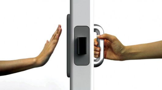
(Thankfully door designers thought of this before me and I have an example to show.)
Push = door with something you can push on. Pull = door with something you can grab.
Beautiful.
Since then I’ve gone a little crazy with the user-focussed design, and my definition of design has broadened to include almost anything you can imagine. For example, my boyfriend and I recently moved into our new apartment, and I was determined to make everything as user-friendly as possible. Have a tendency to throw all your clothes in a big pile on the floor for no discernible reason? Don’t force yourself into doing something that sucks for you, because 1) it’ll always suck and 2) you’ll never really start doing it ‘right.’ Instead, find a way to take what you do naturally and focus that into something more constructive. Design your world so it is user-friendly. So we got two big laundry baskets with lids, one for clean clothes and one for dirty, and instead of piling everything on the floor, we pile everything in them. We still have just as much time/energy to organize clothes as before, but now we’re hiding and organizing the mess in the mean time.
There are no bad users. Just bad design.
This field is deep and broad and vast and insanely rewarding, and I’ve only just scratched the surface. Being a designer means more than making things pretty – it means making things comfortable, inviting, effortless. It means understanding your user’s psychology and being able to play to their strengths while avoiding their weaknesses. It means starting with data and ending with beauty. It means being good at a thousand things other than Photoshop.
I’m now applying this fresh view of the world to my other, older loves – writing and filmmaking. It’s not about knowing your audience and catering to what you imagine their desires to be – it’s about being clear in as simple and elegant a way as possible. In writing, it’s about stepping away from the flourishes and compound sentences and rampant adjectives and just telling the damn story. In film, it’s about stepping away from rampant dialogue and clumsy exposition and zealous CGI. It’s about all I’ve been told by those more talented and knowledgable than I a thousand times over, but never really, deeply understood. It about communication – as is art.
I read a great article the other day in which Whitney Hess, a long-time professional user experience designer, was asked to describe UX design in two hundred words or less. She has a fantastic blog I highly recommend if anyone is interested in this sort of thing. http://whitneyhess.com/blog/ She speaks more of the role of UX design in the corporate product-creation world, which I suppose I am now a part of. As with her work, her words cut straight to the point, and I couldn’t possibly say it any better:
“User Experience is a commitment to developing products and services with purpose, compassion, and integrity. It is the never-ending process of seeing the world from the customers’ perspective and working to improve the quality of their lives. It is the never-ending process of maintaining the health of the business and finding new ways to help it grow sustainably. It is the perfect balance between making money and making meaning.
The user experience practitioner is neither sage nor saint; it is not their role to have all the answers to life’s questions or to advocate for altruism in a capitalist society. They are simply the facilitators of a more collaborative, transparent way of operating in business today — breaking down the walls between silos and bringing the customer into the boardroom.
User Experience is the responsibility of every member of the organization; it is a central philosophy, shared principles. It is not a series of activities and deliverables to perform, but an enlightened way of being.
UX is mindfulness.”
I’m also a little more open to the idea of jewelry makers and florists considering themselves storytellers – because there’s probably way more going on there than I have any idea about, and who am I to say?
… though they probably mean more design than storytelling. Just sayin’.
